Problem: customers clicking in n out because no seamless way to browse thru discovery right now. have to go to categories
Background:
We are a Y-Combinator startup that’s raised over $13M to empower students to better serve each other.
Our product is simple, go to www.duffl.com and order anything you want. It will be at your door step in 10 minutes.
We do this by empowering students to run their own Duffl stores – we call them Admirals.
We’ve built a 7-figure business in a box that any motivated college student can run while pursuing a degree.
We deliver snacks to college students in 10 minutes! Duffl started in a dorm room with the dream of empowering students to better serve each other. Since then, we've employed hundreds of students from across the country, graduated from Y-Combinator, and raised our Series A. We believe that the best way to learn how to build a business is by building a business. Come join us on this crazy ride!
Sprint 1
Scoping -
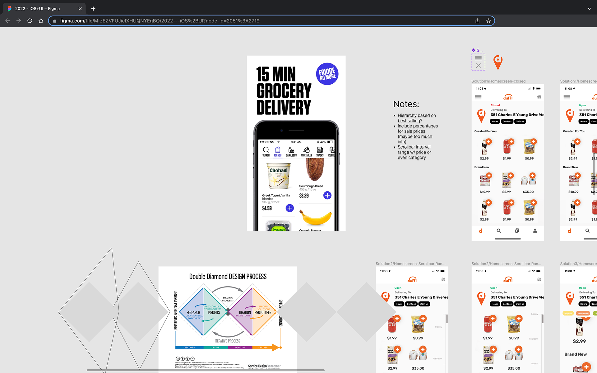
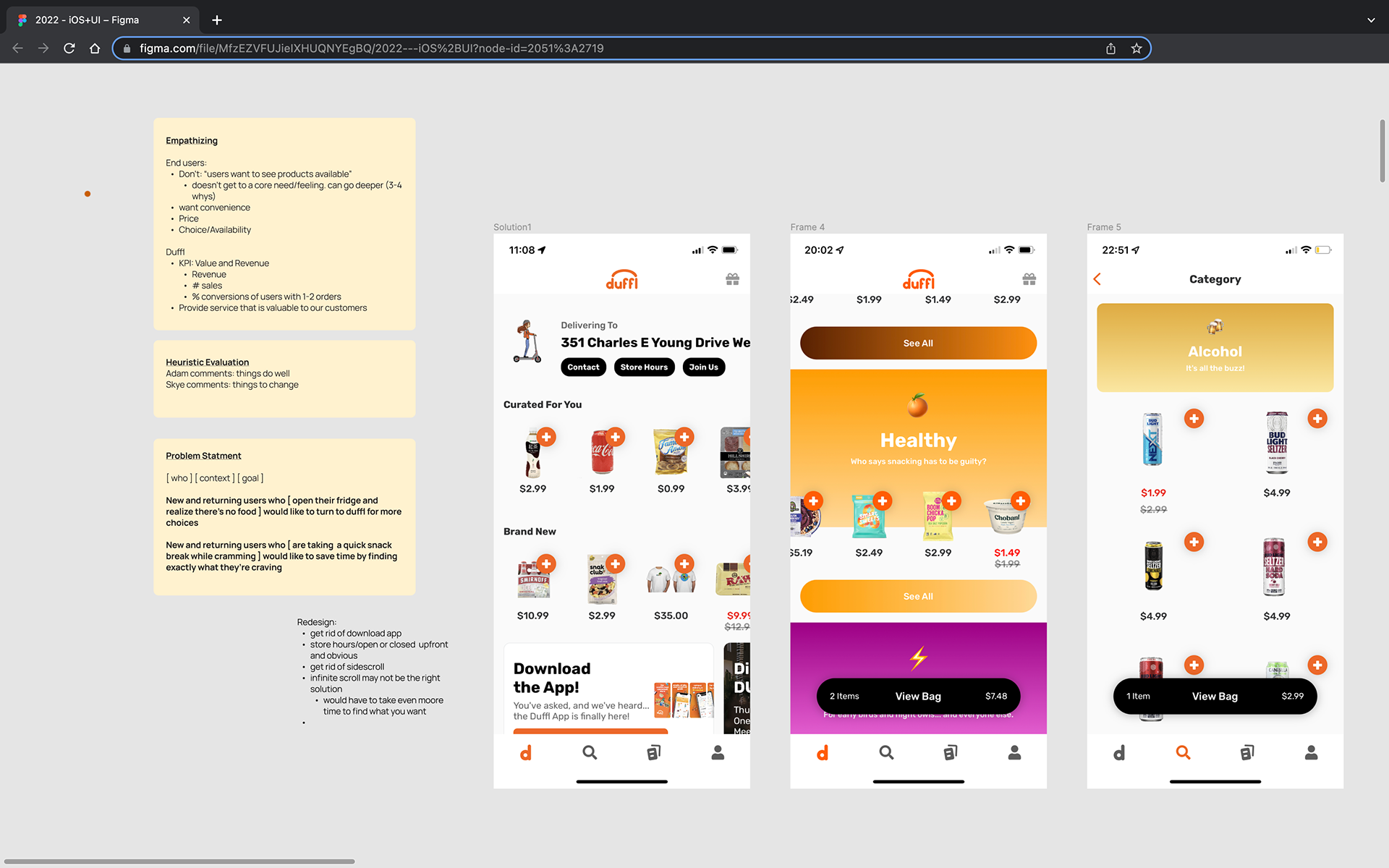
Product UX design is a negotiation between the needs of the user and the needs of the company. Great UX finds common ground in what a user wants and what's good for the company, and in situations where they contradict, UX is the mediator that ensures both sides are getting something they want. Too often, designers go all out on users without understanding the operational needs of the company, and ideas are DOA because they don't play into the strengths of the context in which they work. Not only do I spend time empathizng with users, I also take time to think about what duffl is getting out of this project and what KPIs they're trying to improve. Duffl wants to increase conversion for users with 1-2 orders because that's where the biggest drop off in users returning (given by product manager). Requirements from executive leadership was also to turn it into an infinite scroll like fridge no more.
As for user needs, came up with 2 hypothesis and split into 2 tracks for validation:
New and returning users who [open their fridge and realize there's no food] want to turn to duffl for more choices
New and returning users who [are taking a quick snack break while cramming] would like to save time by finding exactly what they're craving
Reserach -
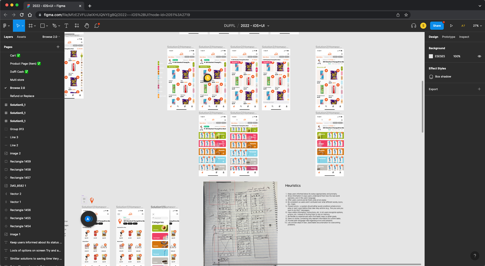
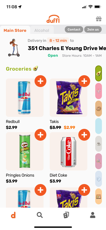
Baseline heuristic evaluation of usability issues with the current browse page. get rid of redundant info (download app ad on app), make pertinent info more transparent (store open/closed & hours), and making main actions easier (minimize clicks before seeing products). Also evaluated competitor UI given from leadership. REALIZED THAT REQUIREMENTS FROM LEADERSHIP (infitite scroll) WOULD NOT BE A GOOD FIT FOR THE PROBLEM BECAUSE IT WOULD BE TOO LONG TO SCROLL. INVESTIGATE ROOT PROBLEM THAT LEADERSHIP THINKS THIS UI WOULD SOLVE.
Began by discussing user needs internally. intern was recent customer that had only ordered once. Analyzed database of interviews already exists (duffl database, adam downloaded)
Work
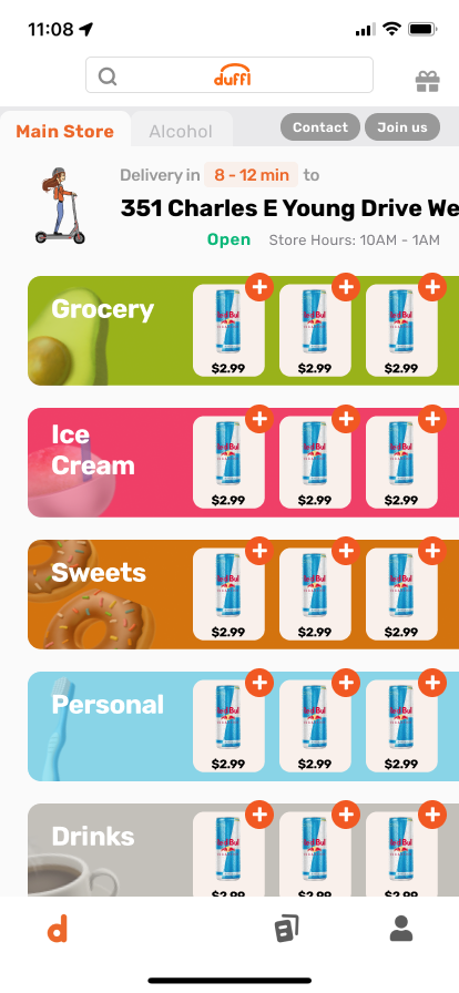
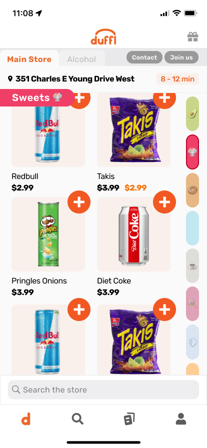
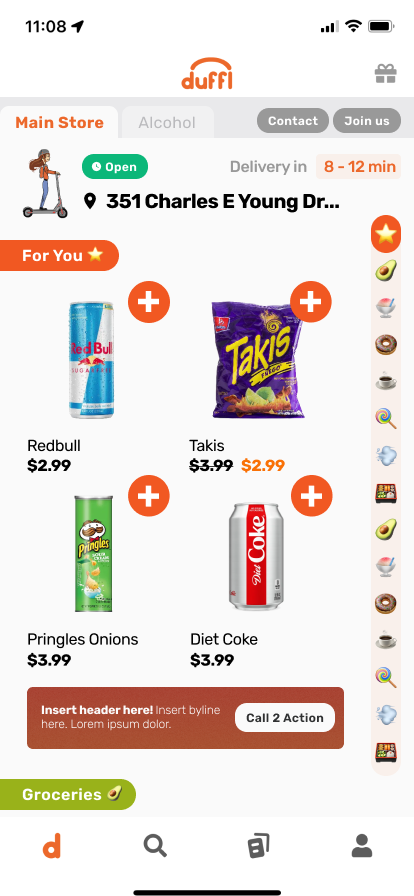
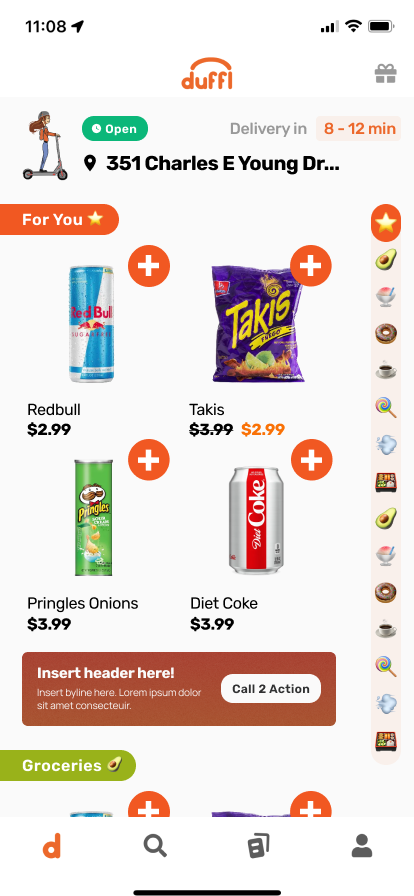
- wireframes
- screens
- explain rationale behind speed scroll
New and returning users who [open their fridge and realize there's no food] want to turn to duffl for more choices
New and returning users who [are taking a quick snack break while cramming] would like to save time by finding exactly what they're craving
Validation - Reviewed with CEO. Chose first one because he then showed me additional data when it comes to attrition of the funnels. showed screen recordings of mouse movements. first one more targeted toward goal.
Sprint 2
Change in leadership. Now work directly under CEO. Clarification of design direction - "it needs to feel like a convenience store of the future"
Scoping - KPI targeting: Click thru rate on browse vs categories Search. Didn't have clean data before (feature flags can't separate between browse and search),
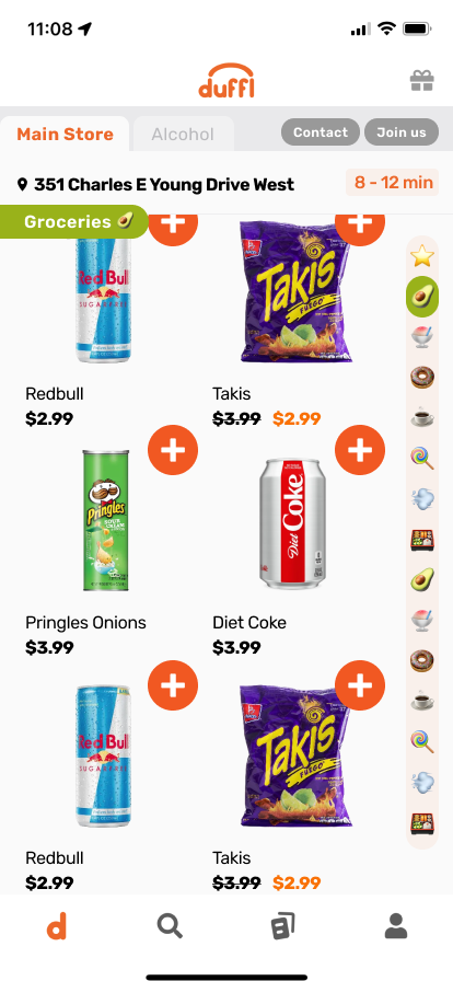
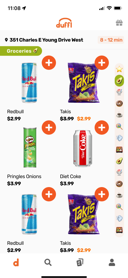
Work - Refinement and exploration. Tried 3 column and fine scroll.
scrolled

3 columns
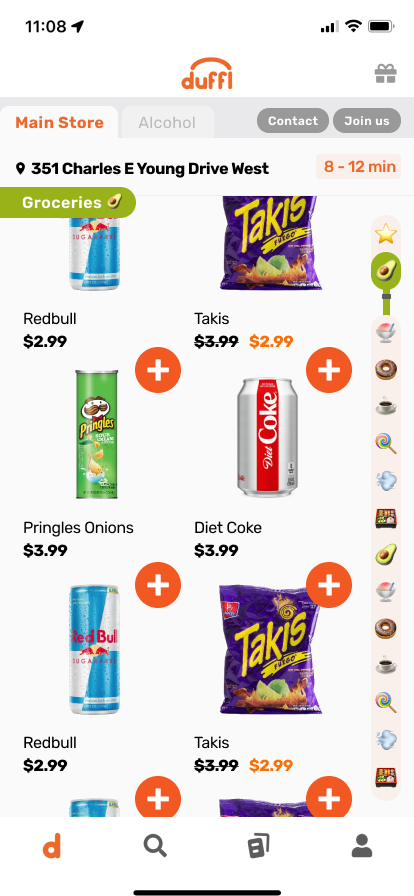
fine scroll
minimal
validation - presentation at all-staff meeting. voting on elements: 2 column, . re-clarification of goal

Sprint 3
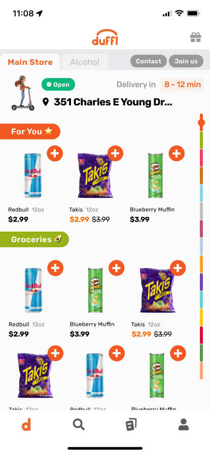
Refinement - add in all elements, including space for ad banner, in preperation for deployment.
Collaborated with devs to modify design to fit technical constraints
validation - AB testing.
Results
Total conversion: 43.04% / 46.12%
Viewed Browse: n=9635 / n=3109
Added item to cart: 59.81%, median time 57s, avg time 2m55s / 60.92, median time 46s, avg time 2m23s
Purchased a product: 43.04%, 71.96% conversion from prev / 46.12%, 75.71 conversion from prev

Updated final, after some other changes were merged:
Take-aways
- don't take exec order as is - understanding biz need and user needs instead to arrive at the optimal solution