Although there were plenty of data visualizers, there was not a way to generate humanistic temporal models using a no-code graphical interface that could create and edit structured data.
That's why Dr. Drucker brought me onboard––she had been researching chronology visualizations for over 20 years, and saw that no current software, platform, or tool for generating temporal visualizations from structured data could create anything other than what adhered to the format of a standard timeline (linear, continuous, isolated, presumptuously objective). Furthermore, there was no way for researchers to work with that structured data outside of a code editor.
Previous iterations of this project were either built in deprecated platforms (Adobe Flash) or purely visual mock-ups, which further emphasized the need for a designer-developer like me.
This tool is, first and foremost, intended for humanities researchers and academics.
Whether it be archeologists, historians, etc., the challenge here was to define a "persona" that didn't preclude certain fields, so it made more sense to focus on specific modes of work. Through Johanna's personal experience and extensive network of fellow scholars, we were able to narrow down 3 types of visualization formats that this tool would need to support: narrative, experiential, and heterochronological.
In addition, we partnered closely with Fachhochschule Potsdam's Urban Complexity Lab (UC Lab) to share data, research, and resources, including processed datasets from their current Anthroposcene Curriculum research.
A note on language: One of my pet peeves when it comes to UX/dev industry thinking is the proliferation of the phrase "solving the problem." You won't catch me using that phrase, because I don't believe that problems can be "solved" the way I'd solve a proof, especially when it comes to people's problems. People are not proofs. Their needs are not problems. Hearts change, contexts change, so no "problem" will ever remain "solved"––I've found it much more effective to think of my work as a perpetual conversation to address peoples' needs. This asserts an ongoing commitment to empathize with and tune into what users are wanting.
Now, without further ado, let's get started.
Cycle 1: Exploration & MVP
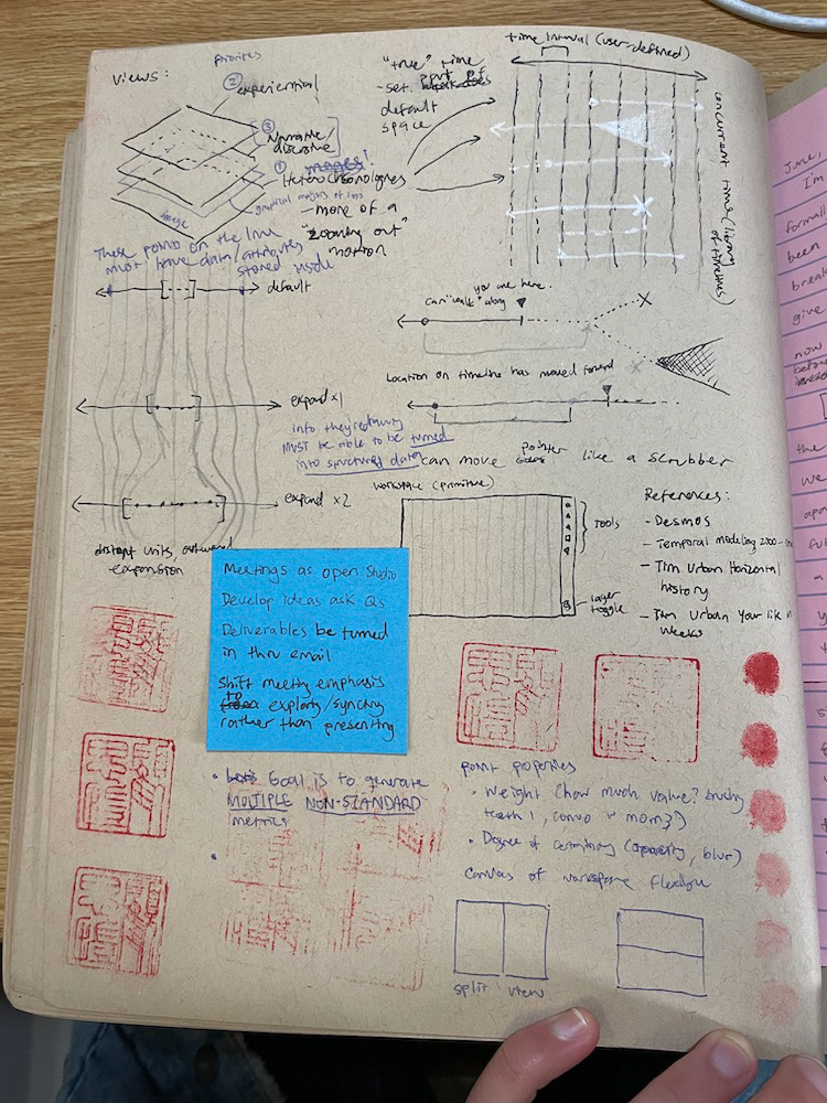
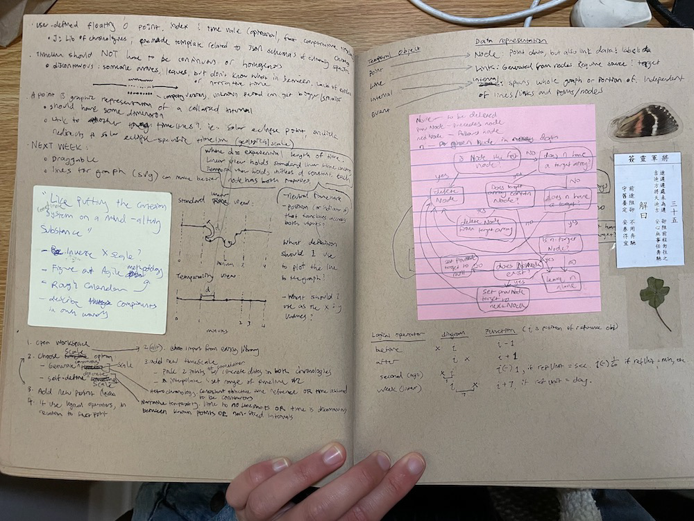
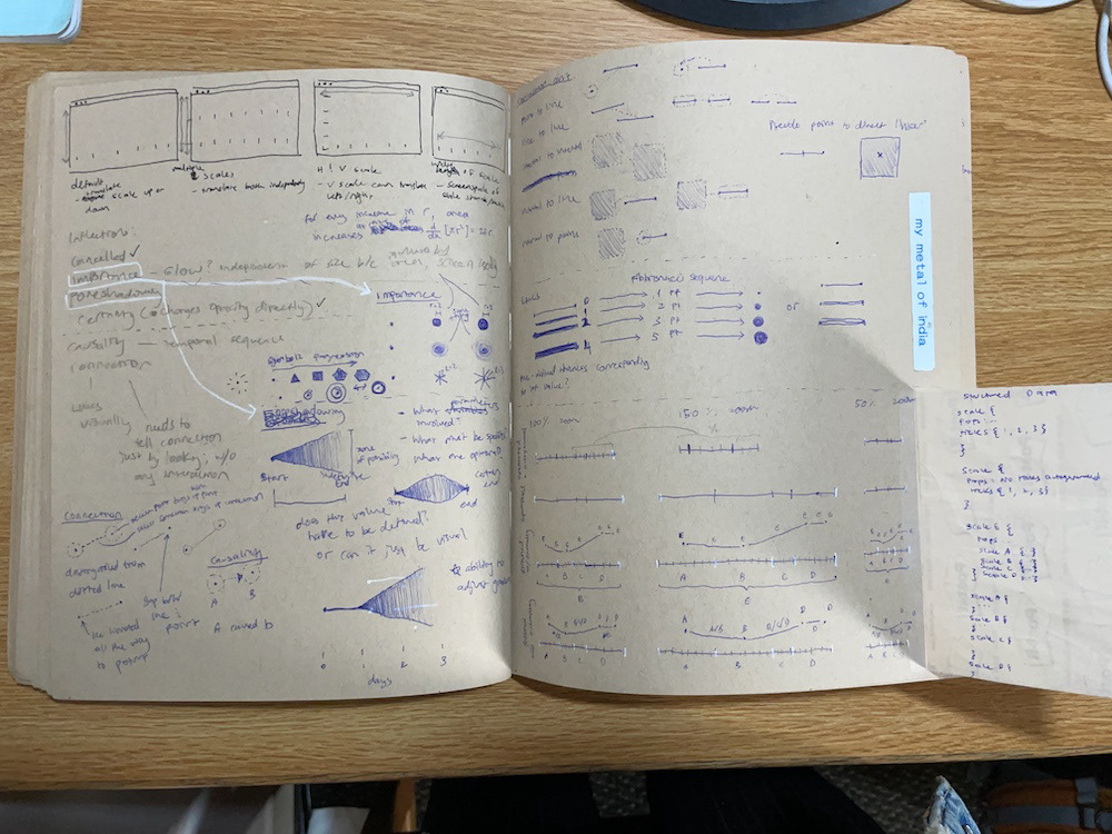
The primary goal during this phase was about outlining all possible functions that this tool would potentially need to support, and ensuring that what was built would not preclude the possibility of future developments. The secondary goal is to begin articulating a form for this project (in other words, what the heck am I making?)
Defining the problem: What's the scope of this project?
Here, I visually worked through the ask and began clarifying what this tool is supposed to do at the highest level. I came to the conclusion that, since it had to be as open-ended as possible, I'd have to forego normal design heuristics to allow users more control over the display at the price of a higher cognitive load. Also, since the interface was serving as the mediator between "data" thinking and "graphic" thinking, the crux of this project lied in the effective abstraction of "data" thinking in a way that made sense for "graphic" thinking, and vice versa.

Putting it in context: What existing tools are good at doing what I want my project to do, and what makes them good?
Even though I was building something novel, there was no reason to reinvent the wheel. That's why I took inspiration from both online graphing calculators (like Desmos) and drawing programs (like Figma). I liked the immediacy of user to screen element––in Figma for example, I can click and drag to create a shape, and in Desmos, I can click on a point to get more information about it.
Building it: What features do I need to successfully perform my task?
This is where Agile Development and Design Thinking comes in. In other words, instead of making a laundry list of features right off the bat, I came up with user stories and thought about what's needed to get a user from Point A to Point B. I asked for Dr. Drucker's input on what stories to prioritize, and only then did I start organizing what features to build.
I ranked everything based on value, clarity, and speed, with priority given to tasks that are of the highest value, most clearly defined, and fastest to develop. That way, I can arrive at a MVP much faster, and still promise a working prototype even if development gets cut short.
Below is the first demo I did for researchers at the UC Lab:
Testing it: Am I addressing the right needs?
Good news: the demo was well-received, and researchers were excited about it. People were speculating on how this could fit into their own projects, which told me that I was on the right track. But that was with me piloting the plane––would researchers be able to navigate this tool on their own? Hence the kick-off of cycle 2.
Cycle 2: UX, UI, & user journey
Now that I had a working prototype, the focus of this cycle was to make it easier for a humanities researcher to use. Here, I did the bulk of prototyping and wire-framing to create interfaces that would guide users through the experience and suggest what actions they can take. I also conducted usability testing to fine-tune page elements.
Defining the problem: Why is it difficult for users to engage with the tool?
Dr. Drucker hosted a 3-day workshop for this project, and we were graciously joined by one designer and researcher from UC Lab, Francesca Morini. Morini's feedback was that, although it was simple to use after the initial learning curve, the lack of guidance in the onboarding process could easily deter prospective researchers from using the tool. Johanna seconded her sentiments, as she had a hard time anticipating how her actions would correlate to results onscreen––for example, she was unsure what the labels on input fields would generate before pressing submit.
Putting it in context: How should users be moving through the tool?
From this initial usability test, I gathered that users had different needs at different stages of use. Furthermore, the range and priority of actions changed depending on the stage as well. The interface would, in some way, have to to prepare or suggest to users what is to come.
Building it: What do the interfaces look like?
I then grouped layouts together based on related tasks that would be executed together, taking care to inform users through environmental cues (like background colors, element styles, etc.) what stage they are in. For example, I separated project creation, empty project, and main workspace into three modes with increasing information density to help slowly ease users into the mindset of work.
Creating a new project
Editing interface
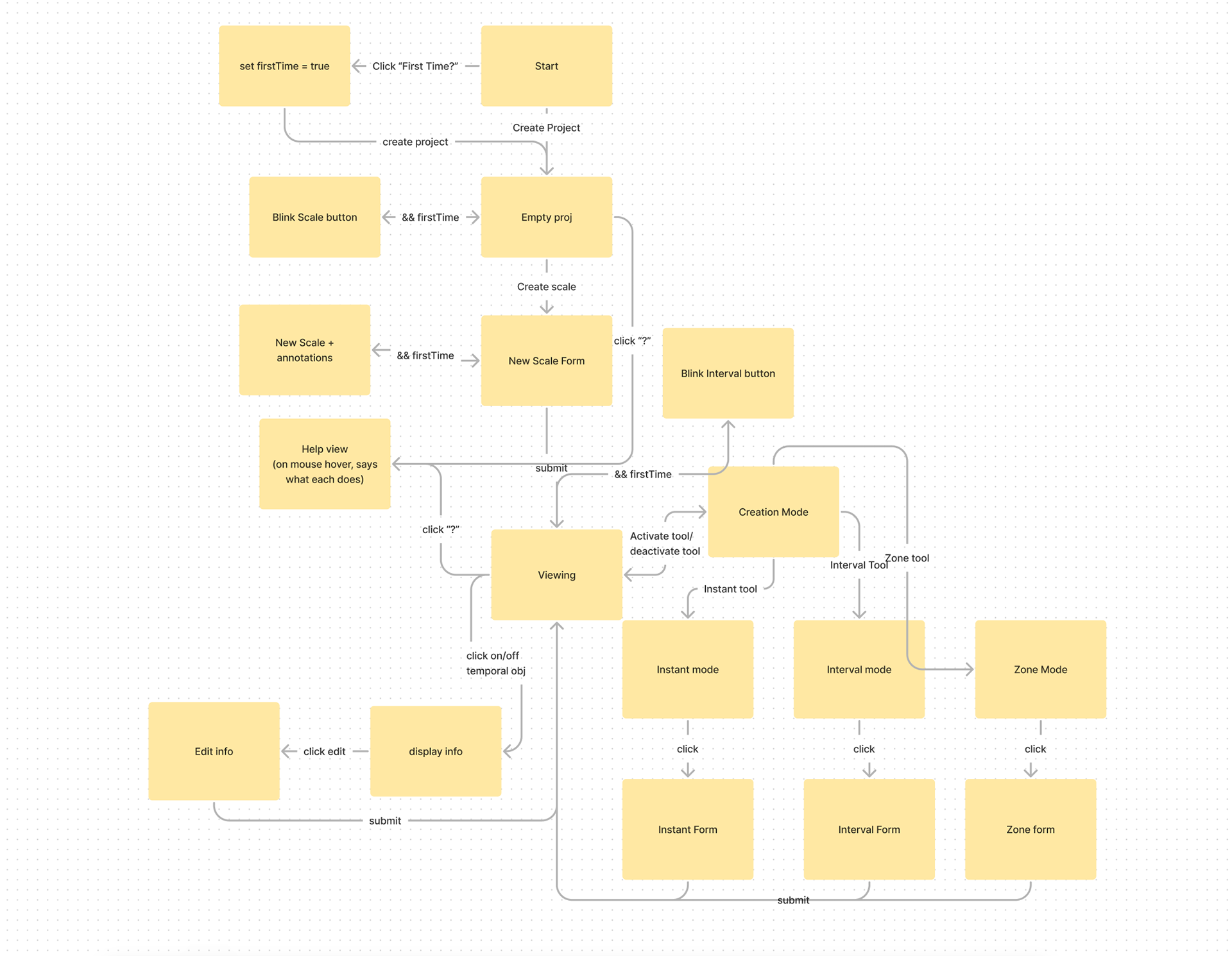
Here, I want to emphasize how my design informs my software development process. Whereas I was coding self-contained and separate components before, only after creating these user flows did it become clear to me that I should structure the front end architecture as a Finite State Machine:
Testing it: How are users responding to the interfaces?
This next iteration was more successful—I was able to measure the improvement in engagement because testers carried out more interactions within the program (mouse clicks, etc.) before asking for help, and began asking for help later than previously. Furthermore, at each stage, they were directing themselves through the program in the order I intended.
However, it became clear that pure interface design was not enough—users expressed that they would need much more guidance before they could navigate ChronoVis: Paintbox successfully on their own.
Cycle 3: Narrowing focus & Deployment
After this project was selected to be in UCLA Undergraduate Research Week 2022, I was faced with a short deadline. Now, I had to fast-track how to make Chronovis: Paintbox usable for first-time users without being there to walk them through it.
Defining the Problem: what is the best option given the time restriction?
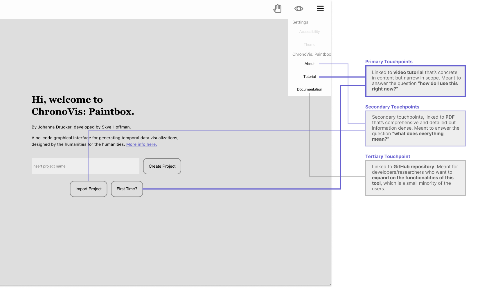
In my architecture flow chart and mockups, I imagined side-by-side tooltips that would be displayed next to screen elements when users were navigating the tool for the first time. However, after assessing the state of the codebase, I realized it would require a massive refactoring overhaul. That forced me to pivot my second choice: video. Although I couldn’t customize the pacing like with tooltips, it was the next most immersive way to demonstrate how to use the tool.
Putting it in context: what should the tutorial cover that would make the most sense for what users are trying to do?
In preparation for the tooltips, Johanna drafted a comprehensive PDF overview of ChronoVis: Paintbox and its features, from which I was happy to borrow. But now that I had shifted medium, the tutorial’s priorities were different––from personal experience, good video tutorials were concrete, succinct, and logical. That’s why I chose to focus on modeling one specific scenario from start to finish.
Building it: what are the touch points for users to access documentation and help?
Testing it: Are users able to follow along?
TBD :)
I was invited to present this work at UCLA's 2022 Undergraduate Research Week and at the "Data Production in the Interface" workshop in Potsdam, Germany.
These channels opened up the possibility of getting more researchers involved in the development and future of this project.
My main takeaway –– although it was challenging to switch between the mindsets of designer vs. developer, a sharp focus on user stories helped unite the two workflows.
Continuous testing throughout each cycle ensured that I was staying on track in addressing researchers' needs.